Using Designer
DESIGNER is a tool that will help you create emails that communicate effectively to your audience. Its drag-and-drop interface makes creating emails simple, and the preview tools allow you to review your email in several different formats so you can be sure that your message will display correctly no matter how the recipient chooses to view it - on a computer, on a tablet, or on a mobile phone.
The DESIGNER button is visible when you create an EMAIL DISTRIBUTION. Click on the button to go to the DESIGNER page to create your email.
!! Any message created in DESIGNER will be saved under the EMAIL MESSAGE tab. However, changes made to the message under this tab will not be saved and visible in the Designer. If you need to edit your email message, you should do it in Designer.
Creating your email
Before you begin to create your email you should plan out what you want your message to say and how you want it to look. For example, do you want to use images? Does your message need a header or footer, or are you sending something that looks more like a letter? Will you be adding hyperlinks? The following steps can be used as a guide as you prepare:
- Do you want to include IMAGES in your email? All images must be a specific size to display properly in your finished message. Before you begin to create your email you should format any images you want to use. They should be either jpg or png images, 75-100 px high.
- Set the basic email body information from the BODY tab such as message width, text and background color, alignment, and font. When you select TEXT blocks to insert the email message, these settings will be applied. (See below for guidance on vertical spacing in text areas.)
- Insert and define a HEADER row if you want to use one.
- Add a logo or banner to the header if desired, and link that image to your website. Set a background color that is different from the email body, if desired.
- Switch views by clicking on the EYE icon in the lower left corner of the screen, and make any adjustments needed to make the header and logo to look good in the mobile settings.
- Insert and define a FOOTER row if you want to use one.
- Add a logo to the footer if desired, contact information, and a link to your website. Set a background color that is different from the email body, if desired.
- Switch views by clicking on the EYE icon in the lower left corner of the screen, and make any adjustments needed to make the footer look good in the mobile settings.
- Insert a TEXT block between the header and the footer to hold your content. The text in this block will use the default settings you set in the BODY. In addition, when you are working in the text block, you will see a selection of GUI tools that you can use to format specific portions of your message - font tools, text and background color, bold and italics, merge tags, alignment, hypertext links, etc.
- Use separate text blocks for each section of the message.
- Use DIVIDERS, IMAGES, BUTTONS, etc. as needed to enhance your message and its appearance.
- SAVE EARLY AND SAVE OFTEN
Vertical Spacing in Text Areas - Best Practices
The appearance of the email body you see is consistent in the following places:
- Designer Preview mode, accessed via the eyeball icon in the lower left corner;
- the Email Message > Message field in DonorPoint; and
- the actual rendered email across email clients, email apps, and webmail in various browsers.
Best practices for Designer-configured text include:
- Add blank lines between paragraphs within Designer text blocks when you need vertical spacing. (Yup, press the enter key twice instead of once!)
- Set Line Height=120 in text areas, backing off from the Designer default of 140.
- Use Ctrl-Enter at the ends of lines in contact/signature blocks. (This inserts line breaks, rather than ending/starting a new paragraph for each line.)
- Reduce the Container Padding for top and bottom, if you have text areas stacked one on top of the other, so you don’t get “double padded”.
First published in Devlopment Bulletin 2023-04B; updated 2023-05B; added 2023-05-31 NTK.
Using Mergetags
You use MERGETAGS to insert information into your email, so you can customize your message to individual recipients. There are many different mergetags you can select from, depending on the kind of information you want to insert:
- Transaction information, including purchaser information, additional contact information, payment information, and items purchased
- Community fundraising information, including the name of the community and links to the fundraiser
- Team, that is, information related to team fundraising efforts.
- User, that is, the person who created the email, including name and/or email address.
- Account, including the name of your account and the image on the account.
- Email, including the recipient contact’s name or email.
To see the available mergetags click on the #MERGE dropdown in the GUI tools toolbar.
To find out exactly what information a mergetag contains, hover your mouse over the tag name in the mergetag dropdown.
For a partial list of mergetags see Mergetags
- If you need specific information to insert into an email and you do not see an appropriate mergetag contact DonorPoint Technical Support at help@donorpoint.com.
Setting Brand Colors for Designer
Brand colors can be pre-set for individual Accounts, so they can be easily applied from the color-palette tools in Designer:
- Your brand colors will be offered as the first colors in the palette, every time you open Designer.
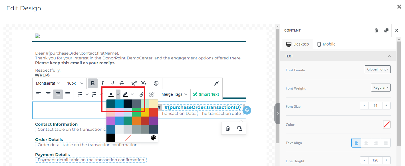
- The in-line palette is used for applying color within the text of an email message to override the default text color. It’s accessed through the text-color (A) or highlighter dropdown.
In this example, color is being applied to a heading:
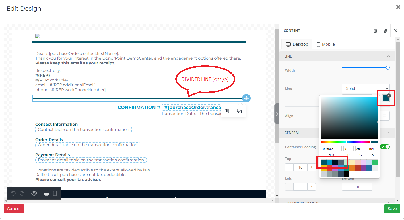
The main palette is available in the styling panel on the right-hand side, and is used for assigning default and area/element coloring. It’s opened by clicking the color square associated with a property.
In this example, color is being applied to a separator using the styling panel:
Any ad-hoc custom colors that you add to the palette manually to support co-branding or campaign styling that varies from your brand colors, are:
- offered as the last colors in the palettes in Designer, instead of as the first.
- available only for that Designer session. They not saved as user- or system-wide defaults.
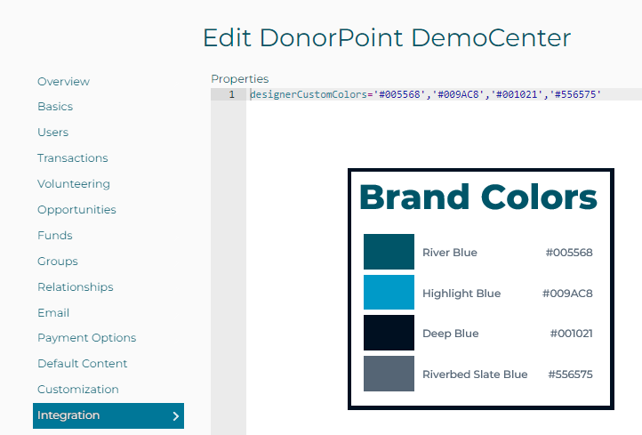
Your local Super User can configure your Account’s brand colors:
- Collect the hex values for each color in your brand standard. (They’ll be in this format: #xxxxxx.)
- Go to Manage My Account > Integrations > Properties:
- Enter a new property row for designerCustomColors=, with each hex value in single quotes, and the list separated by commas:
Resources
The following tools will help you find the values you need if you don’t have a brand color cheat sheet, or it doesn’t include hex values:
- Converting your RGB colors to hex values: https://www.w3schools.com/colors/colors_converter.asp
- Identifying your colors from an image or website: https://imagecolorpicker.com/en
First published in Devlopment Bulletin 2023-05A; added 2023-05-31 NTK.